
Evolving with Purpose: The Voscap Brand Refresh
A RENEWED LOOK FOR A STRONGER CONNECTION, CLEARER COMMUNICATION, AND TRUSTED SUPPORT.
In the world of business recovery, how you present yourself matters just as much as the work you do. A professional, approachable, and trustworthy brand helps instil confidence in clients and stakeholders who are often facing challenging times.
At Voscap Business Recovery, we’ve recently undergone a brand refresh designed to better reflect who we are today — a forward-thinking, people-first business recovery firm with deep expertise and unwavering professionalism. This rebrand is more than a visual change; it’s an evolution of our values, identity, and service commitment.
THE NEW LOGO: PRECISION MEETS STABILITY
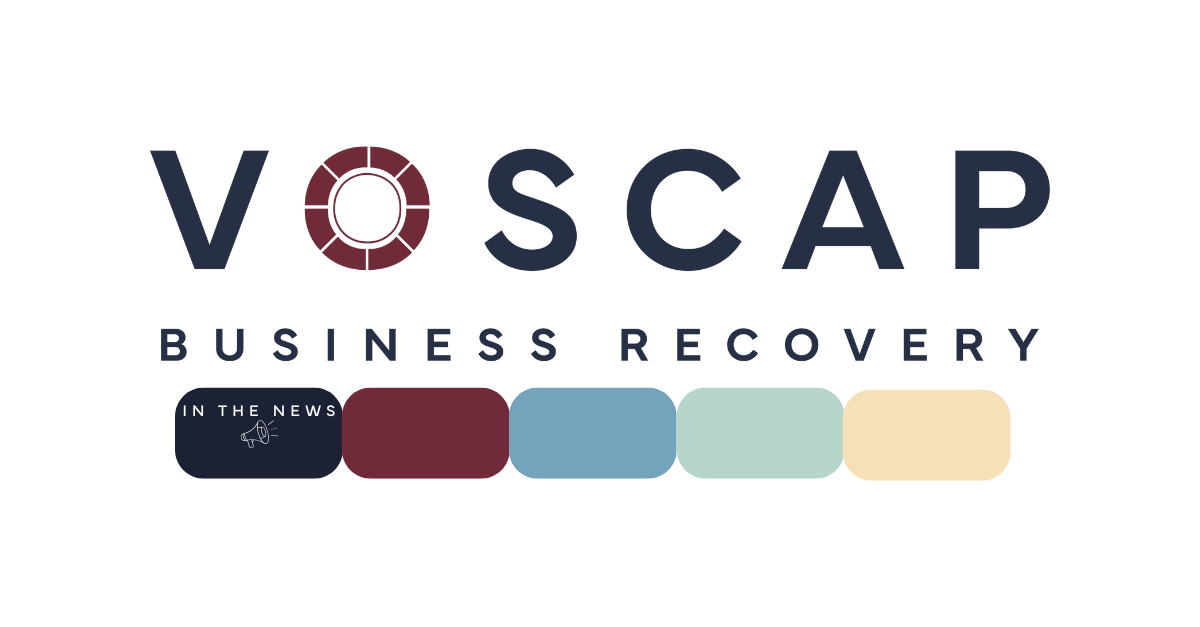
Our new logo introduces a clean, modern design that encapsulates what Voscap stands for: clarity, complexity, and care.
At the heart of the logo is a dial — a symbol of accuracy and attention to detail. It’s a bold, structured emblem that represents both the technical nature of our work and the strategic confidence with which we deliver it.
THE NEW COLOUR: BURGUNDY FOR STRENGTH AND TRUST
Colour plays a powerful role in how a business is perceived. Our new primary colour — a grounded, professional burgundy — was carefully selected to communicate reliability, strength, and sophistication.
THE NEW WEBSITE: ACCESSIBLE, EMPOWERING AND CLIENT-CENTRIC
A vital part of our rebrand was the complete redesign of the Voscap website. More than just a visual update, our new site was built with the user in mind — whether it’s a business director facing financial difficulty or a creditor seeking clear answers.
The new website is modern, responsive, and refreshingly simple to use. It offers multiple ways to get in touch, from quick enquiry forms to detailed service breakdowns. Accessibility and transparency were key drivers behind its design.
HEAR MORE FROM OUR CREATIVE DESIGNER: LIZ HOOKWAY
We sat down with our creative lead Liz Hookway to explore the thinking behind the rebrand:
What vision did you have for Voscap Business Recovery? How was this reflected in the new logo?
‘From the outset, the vision was to position Voscap as a trusted, intelligent guide through moments of financial uncertainty - a brand that feels both reassuring and quietly powerful. The new logo captures this by balancing bold typography with the dial icon, which represents clarity, control, and protection. It’s inspired by a safe dial which is a symbol of security, discretion, and stability. It also hints at direction, as if you’re turning something towards the right outcome. That felt incredibly aligned with Voscap’s mission: helping businesses reset and recover with expert support.’
How did you choose the new colour palette without losing Voscap’s original identity?
The aim wasn’t to reinvent Voscap, but to refine it. I wanted to keep what was familiar and trusted and elevate the overall aesthetic. I retained the navy as a key anchor but evolved it into ‘Oxford Blue’ a deeper, more assured tone that still feels instantly recognisable. Similarly, the original gold was softened to a warmer ‘Eggshell’ to feel more welcoming and new.
These subtle shifts helped modernise the brand without losing its sense of continuity. Every colour was chosen to reflect Voscap’s personality: dependable, professional, and reassuring but also approachable and confident. The result ensures Voscap still feels like Voscap - just sharper, clearer and more aligned with who they are today.
What do you consider important when designing a company’s website? How is this seen in Voscap’s new site?
For me, the key is clarity, structure, and tone. A website should feel like an extension of the brand’s personality, both intuitive and reassuring. The new site has been designed with the user in mind at every stage: it’s clean, navigable, and purposeful. I stripped back the noise and focused on guiding people to the information they need quickly, especially during high-stress situations. Whether someone needs urgent advice or wants to understand their options, the site feels like a calm space - visually clear and professional.
CONCLUSION: A STRONGER IDENTITY FOR A STRONGER FUTURE
At Voscap, we’ve always believed in high standards, clear communication, and putting people first. This refreshed brand helps us express that with greater clarity, while staying true to who we’ve always been.
If you’re facing financial uncertainty or want to learn more about how we support businesses, we encourage you to visit our new website or get in touch with our experienced team. Voscap is here to help you move forward — with confidence, strategy, and strength.
To see more of Liz’s amazing work visit her website: Liz Hookway
ABOUT VOSCAP
Voscap’s primary objective is to save your business. Our team of experts’ knowledge in restructuring and turnaround assignments is invaluable when assessing the best option available to your needs. With experience spanning several decades, we have the skill and resources to provide viable solutions within all industry sectors. All organisations go through difficult times and we are here to help. From small to multi-million turnover businesses, we have dealt with the most complex of cases. We offer an initial free assessment in analysing your financial position and providing clear and precise advice making your experience a simple non-complicated process.